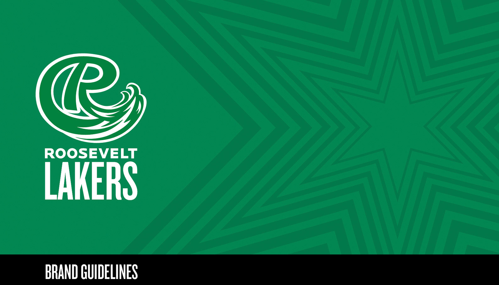
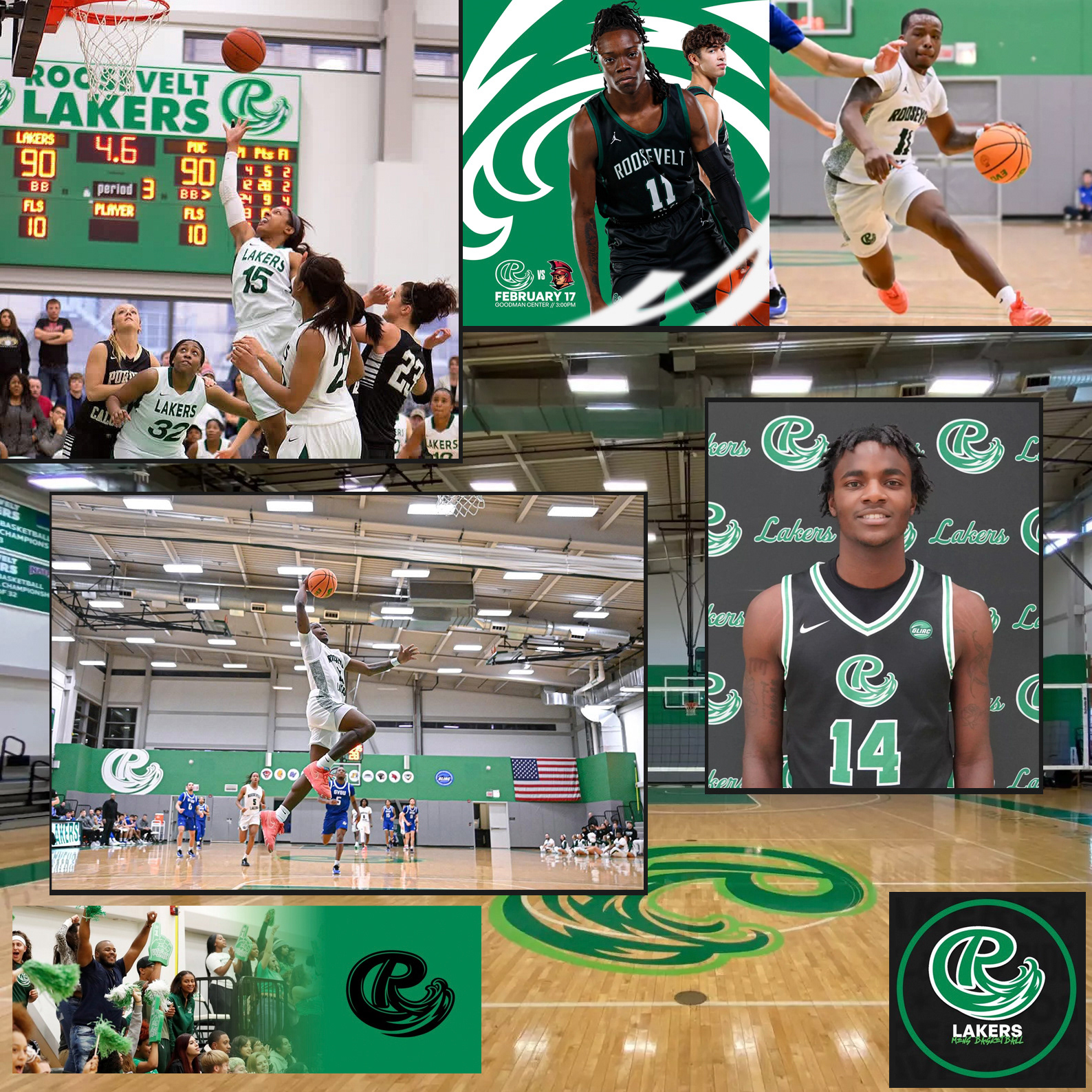
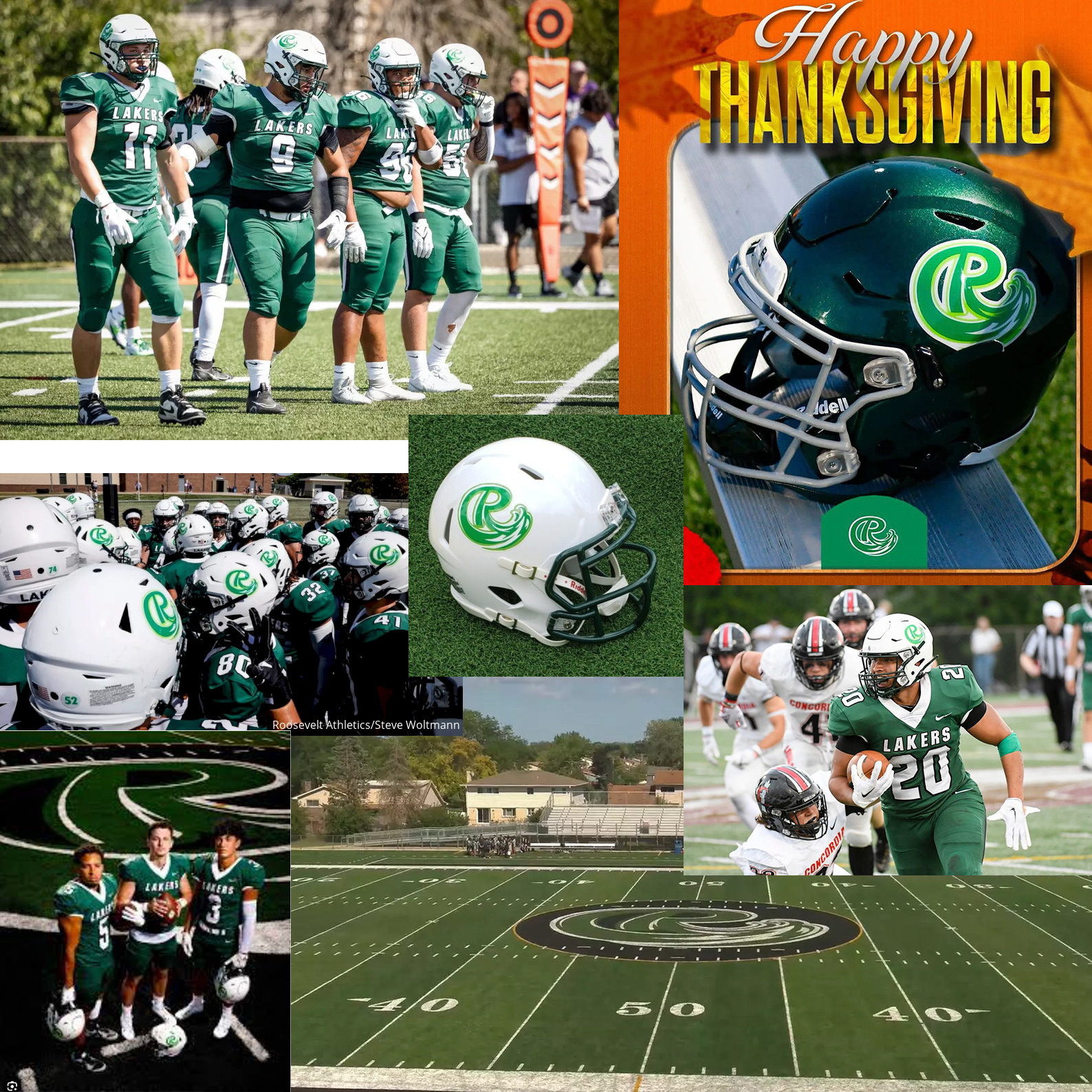
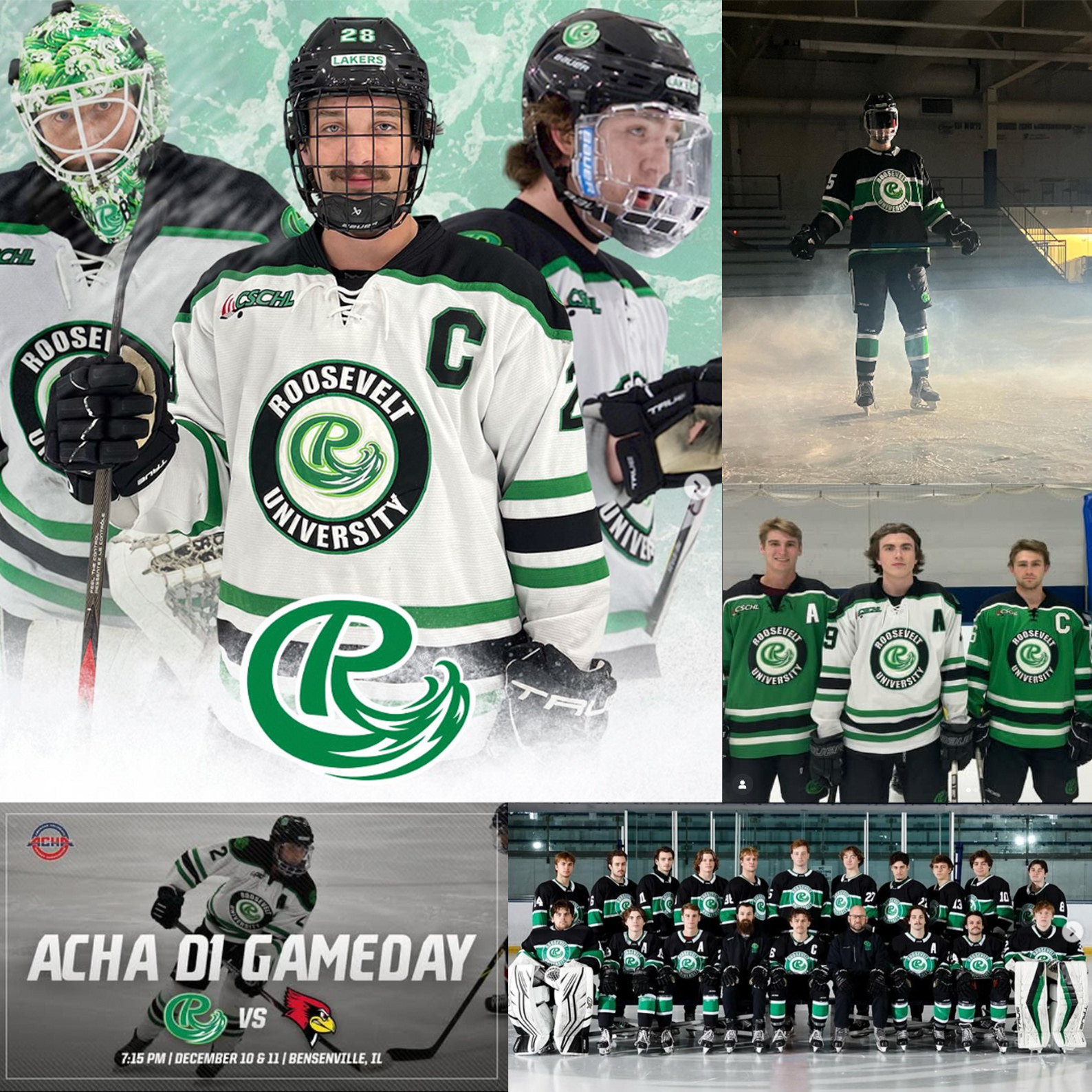
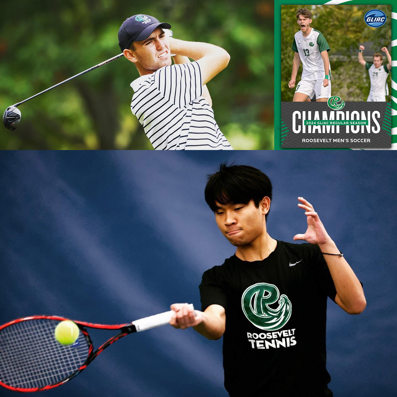
Roosevelt Lakers — Collegiate Athletics Rebrand • Client: Roosevelt University, Chicago, IL
Creative Partner: Studio Blue • Role: Lead Logo Designer / Visual Systems Development
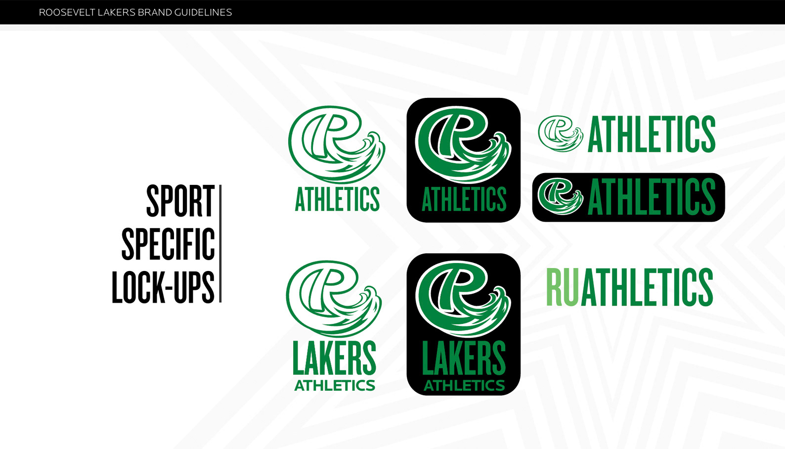
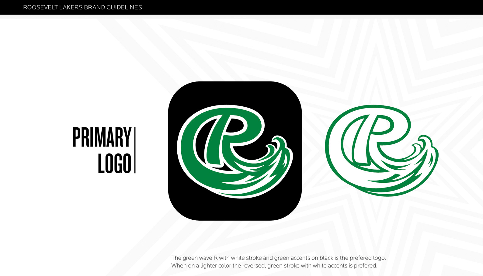
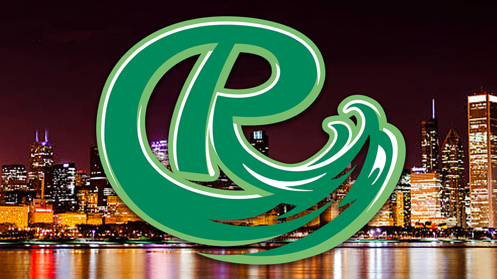
Project: Collegiate Athletics Identity "ROOSEVELT LAKERS" — “The Green Wave R”
OverviewWhen Roosevelt University set out to bring back its collegiate athletics program, they wanted more than just a new logo — they wanted a symbol that embodied momentum, motion, and modern Chicago energy.
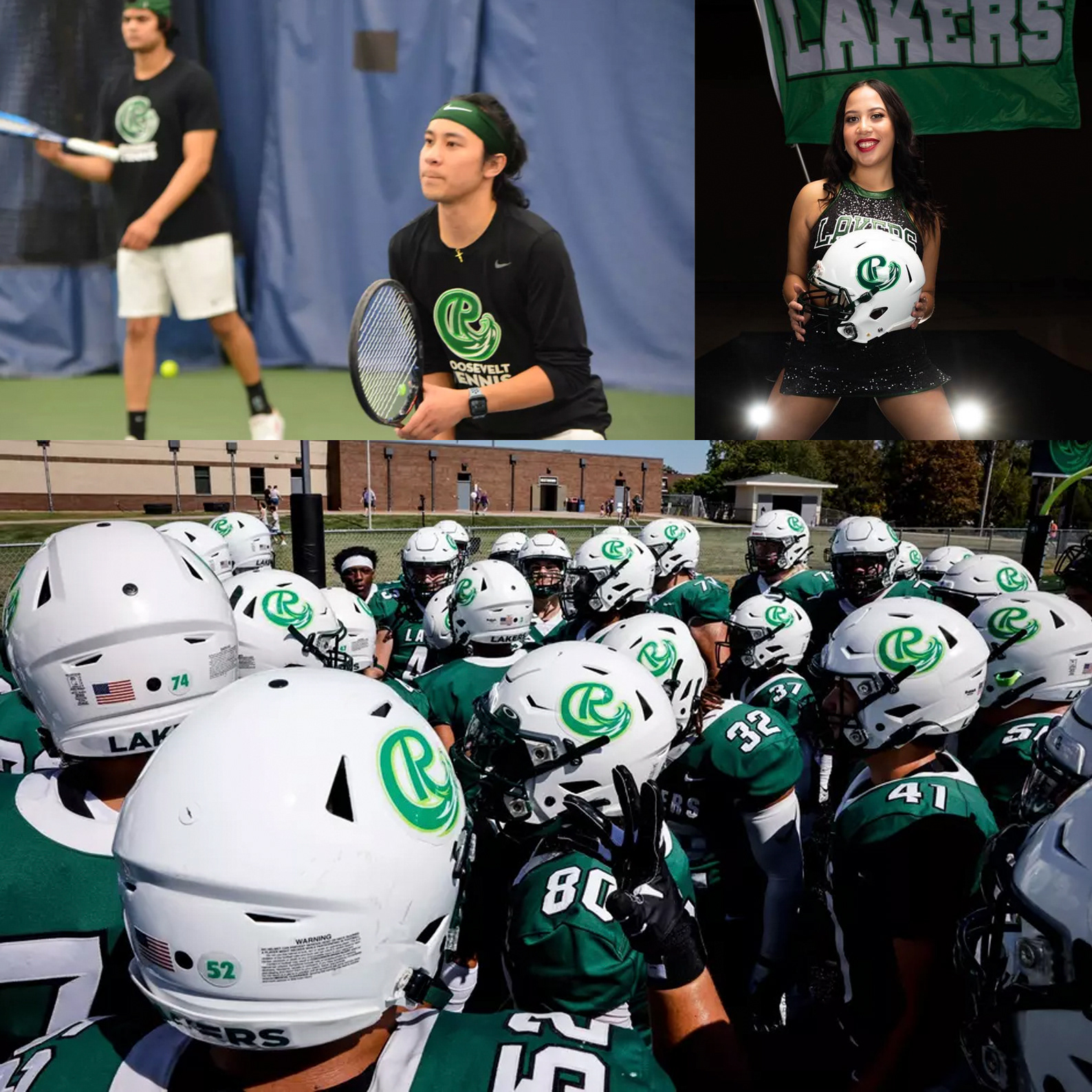
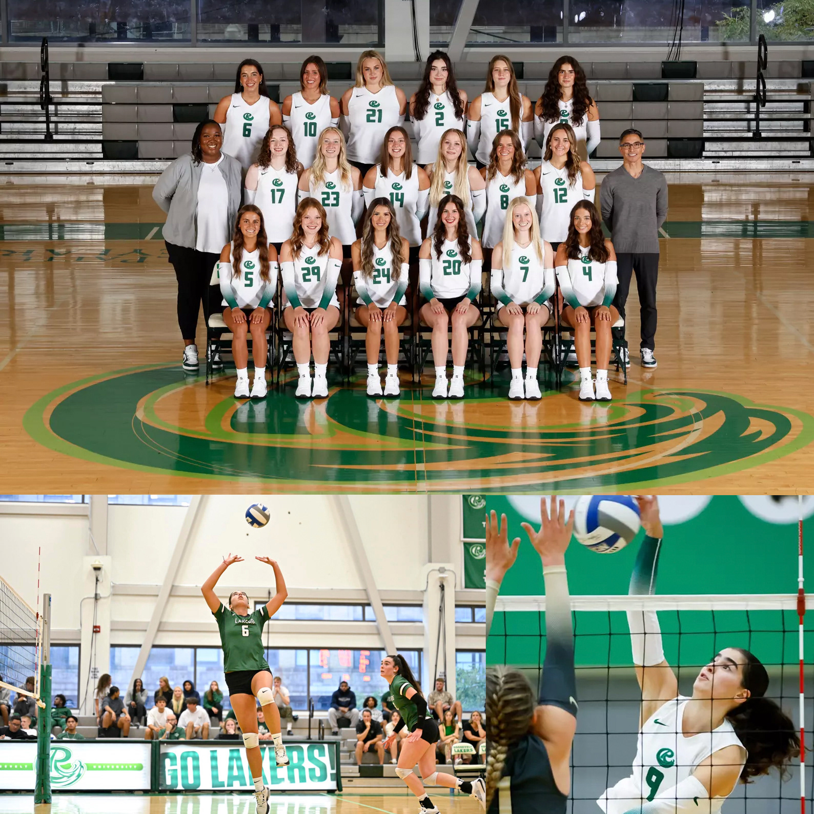
Working in collaboration with Studio Blue, I was brought in to concept and design a new athletic mark for the Roosevelt Lakers — a unified icon that could carry across every sport, uniform, and fan experience. The final result is what we now call “The Green Wave R.”
This mark was conceived after nearly 100 iterations exploring typographic forms, wave motion, and symmetry — the challenge was to merge Roosevelt’s strong collegiate “R” heritage with the idea of a rising tide, a visual metaphor for growth, resurgence, and unstoppable forward drive.
Concept
The core of the design is the “R” in motion — a wave that crests upward, symbolizing both Lake Michigan’s energy (the Lake is so big it has waves) and Roosevelt’s upward trajectory as an institution.
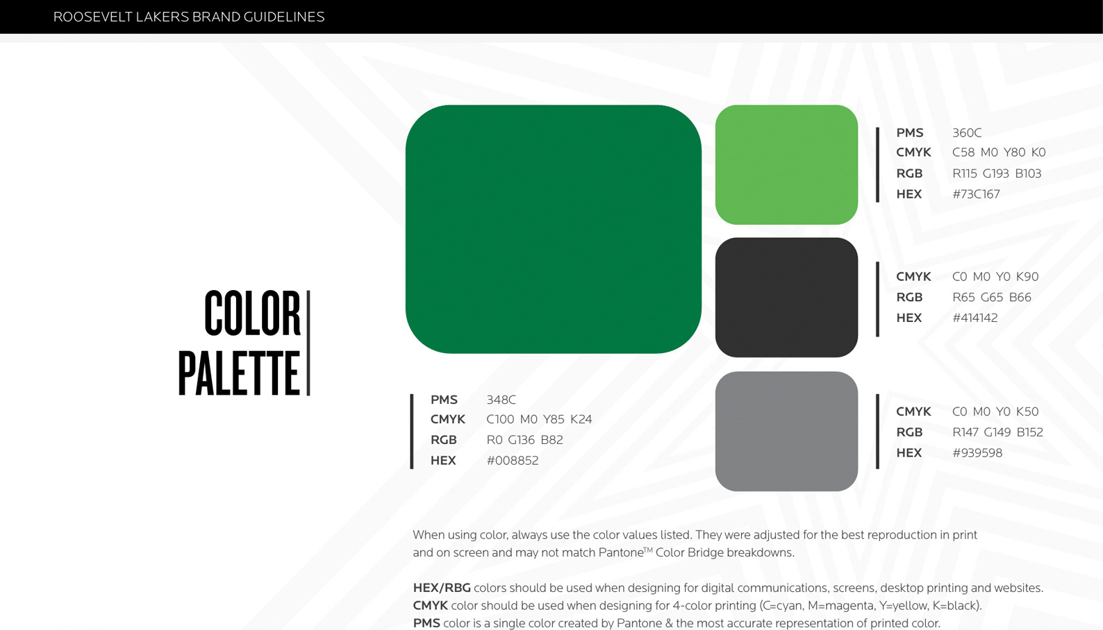
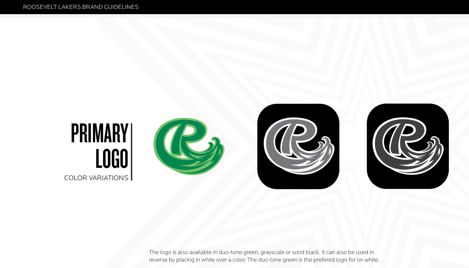
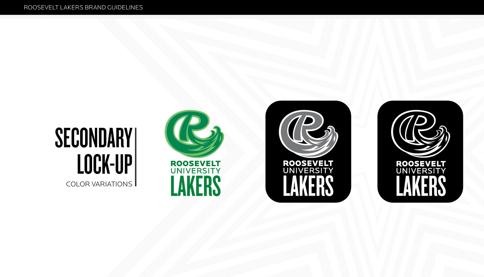
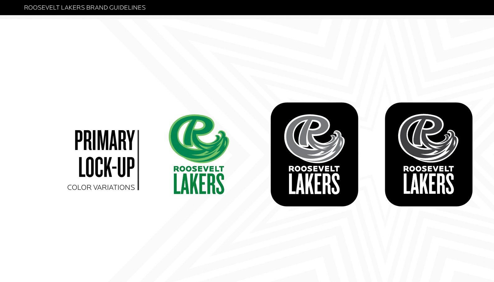
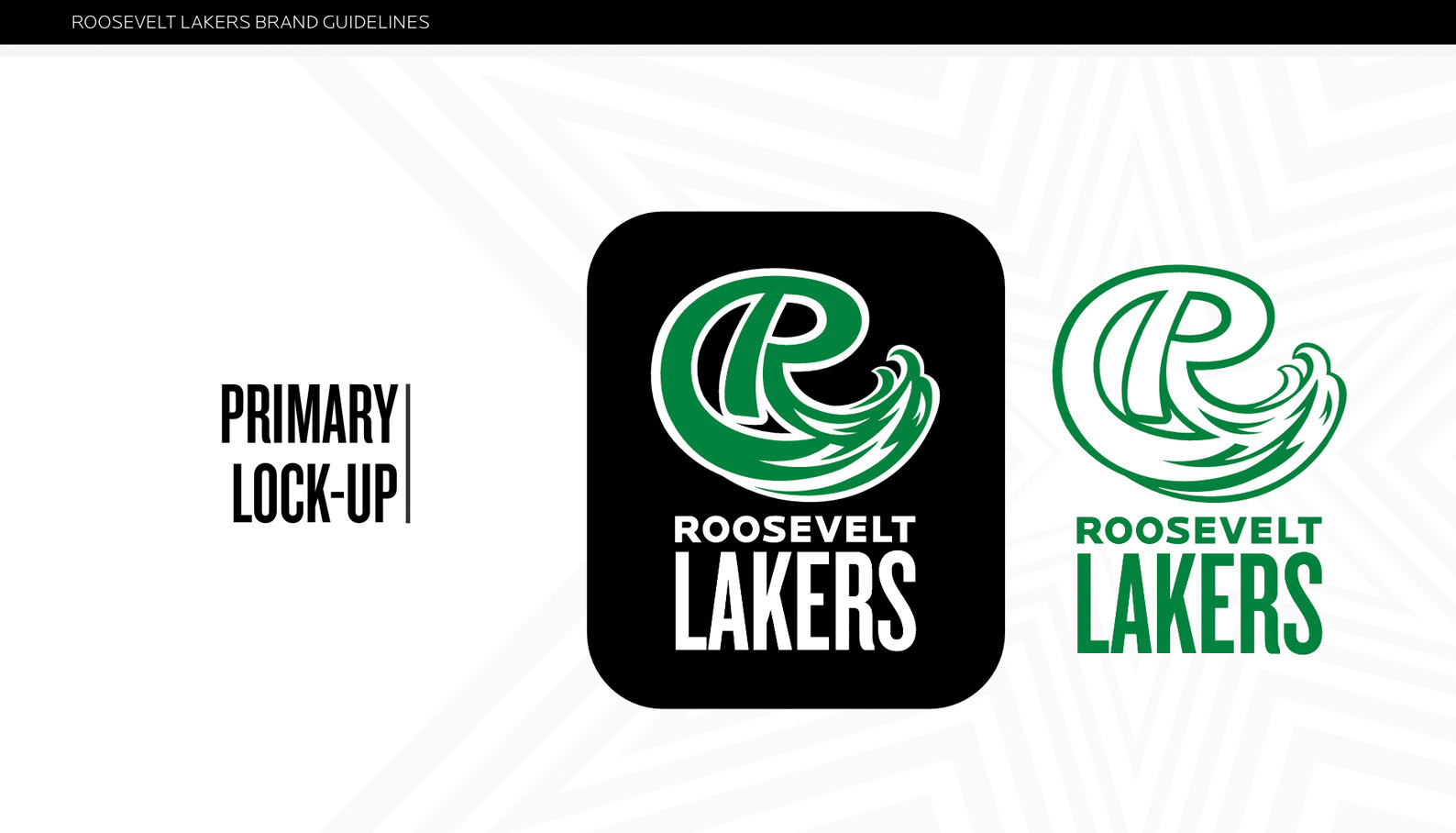
The mark balances geometric strength with fluid motion: • The base of the R grounds it in academic tradition • The wave-like curve introduces dynamism and athletic spirit • The negative space is intentionally carved to evoke water and wind — the essence of the “Lakers.” • Every curve and line was tested for legibility at distance and impact on apparel, signage, and digital applications.
Process
From first sketches to final vector form, this project was a full-spectrum design journey: • Hand sketches exploring the motion of waves through an R. • Dozens of digital studies testing angle, depth, and weight.
Iterative feedback rounds between Studio Blue, Roosevelt Athletics, and internal university leadership • Refinement for scalability and brand consistency across all applications.
After almost a hundred variations, the chosen mark struck the perfect balance — strong, sleek, and instantly recognizable.
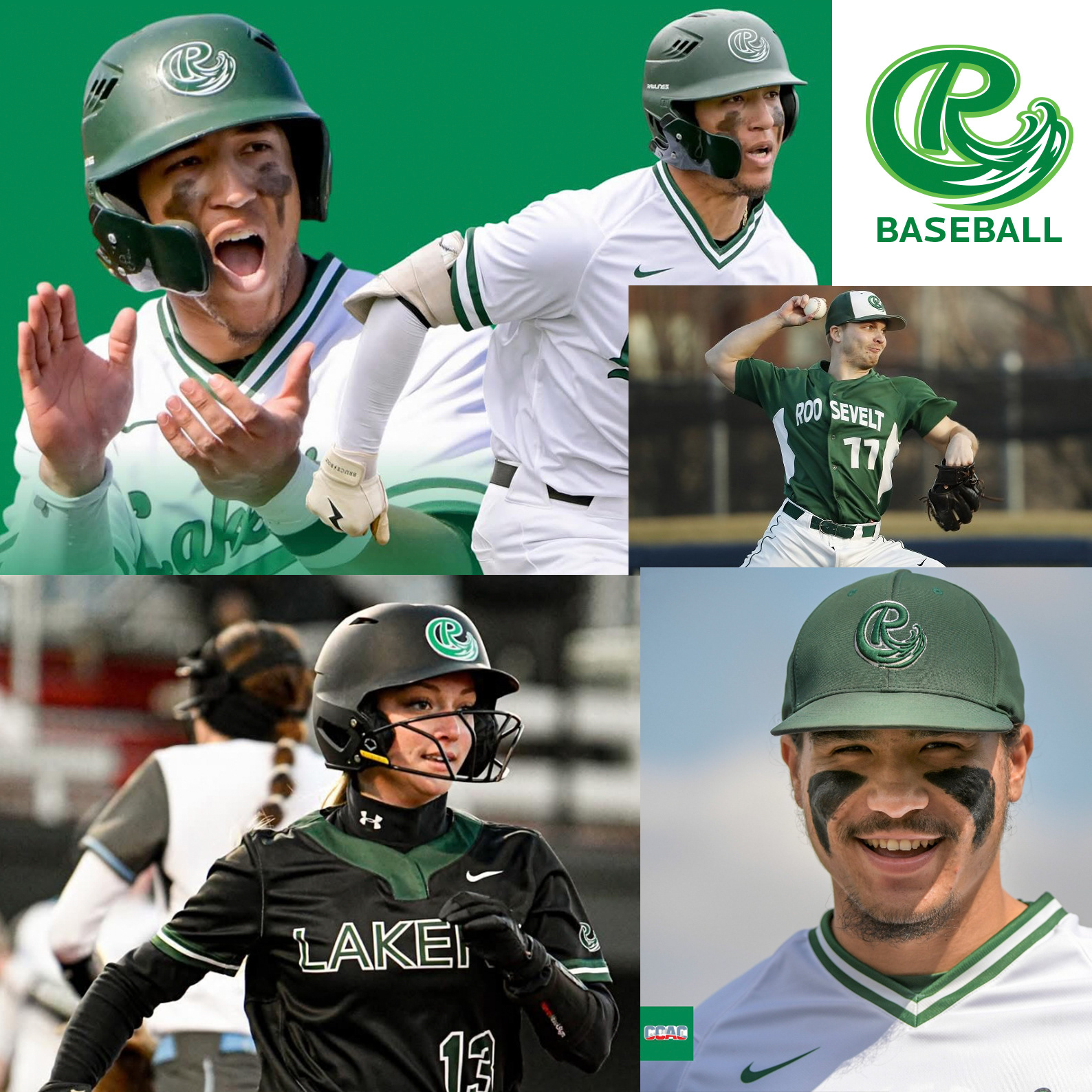
Outcome
The Roosevelt Lakers rebrand launched alongside the university’s expansion into new sports programs and their transition toward NCAA Division II competition. The Green Wave R now anchors the entire athletics identity, appearing across jerseys, merchandise, facilities, and digital platforms.
It’s more than a logo — it’s the new face of Roosevelt athletics. A wave of progress. A mark of pride.